

south side young adults
Project Details
Project Overview:
South Side Young Adults (SSYA) is a Young Adults Community Group for South Side Baptist Church and strives to get Young Adults connected to the Church. They didn't have a way to digitally connect with that demographic, that's where I helped out!
Project Requests:
-
The logo needed to be modern, minimal, but points back to the Cross
-
The Logo needed to be capable of going on invite cards, banners, clothing, etc.
-
Logo Colors: Needs to fit South Side's blue/ white color scheme
Project Strategy:
-
I chose a heavy, gothic, font to stand out on multiple color schemes
-
To help represent the cross, I used three different shades of blue to represent their 3 core values: Rooted, Built Up, and Established all with a Cross at the center
Invitation Cards
These cards feature a modern and easy way to get the word out for SSYA. The cards have rounded corners and a QR linking to their webpage
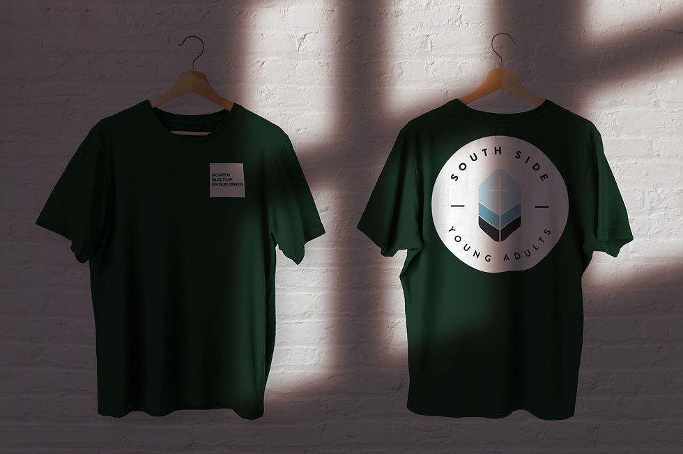
Clothing
The clothing incorporates their logo on the front pocket area followed by a larger logo on the back to keep down expenses
further elevating the brand
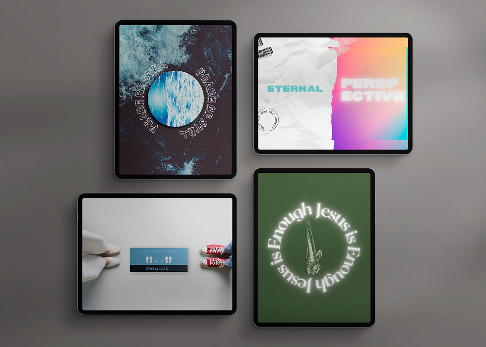
lesson graphics
Lesson Graphics offered eye catching aesthetic that can be presented through social media and Pro Presenter

Fonts:
Primary: Gotham Black
Secondary: Brandon Grotesque

Hex: c2eaf2
Hex: 63b4d4
Hex: 111921
Color Scheme:

Primary Logo
This Logo has 3 different levels/ shades representing SSYA's core values of: Rooted, Built Up, and Established
